- IT Services
- IT Support & Services
- Backup & Recovery Services

Basic Online applications user interface updates and enhancements
Basic Online applications user interface updates and enhancements
We are always looking to improve the user experience and have recently enhanced our online cloud applications with an updated look and feel.
There are a few simple changes that we hope will make using our online software that little bit easier.
If you have any feedback or wish to make any suggestion we’d be happy to hear from you.
Font changes
We have introduced a new font called Open Sans. This is a popular font and one which has been made available by Google. By including this font we have increased legibility and the font should be smoother and easier to read.
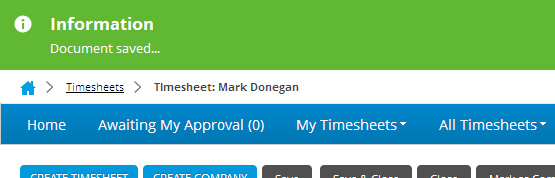
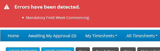
Alert messages
The old alerts have been replaced with a more common and recognisable alert.
They are no longer placed in the middle of the page, pushing down content. Successful Saves and Error messages have been moved to slide in from the top of the browser and have a higher contrast and are therefore clearer.
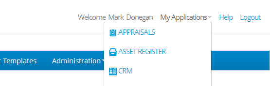
Application links
The “My Applications” link which displays a list of all of your subscribed applications has been moved to the top of the page. By doing this we save a small amount room.
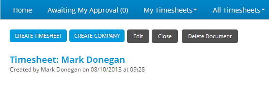
Action buttons
The action buttons have all been grouped together and closer to the content they are relevant to. This again saves a small amount of room but also connects the buttons with the content they affect.
Future Updates
There have also been many changes in the back-end which has made our online applications faster. Changes have also been made which will allow us to develop the functionality of the various applications. We hope to tell you about these improvements soon.
These changes will be rolled out in the next few days and you will be informed of the update as they happen.